


Charts, Tables, & Graphs
This section is for people that love numbers. If there is a numerical analysis you would like to see here, let us know.
Trading Up
When real estate prices are rapidly increasing, some people believe that the best course of action is to buy whatever they can afford so they can "get on the equity escalator" and "trade up" to a nicer house later. This first chart shows the innefectiveness of that strategy.In the scenario described by the chart below, a starter home costs $100,000, and the cost of all homes is increasing at 20% per year.
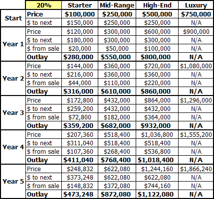
As you can see, although the starter home is gains a decent amount of value every year, the higher value homes' increase in cost even faster. The homebuyer that stretches to get into the "starter home" will be essentially stuck in their home, in no better a position to "trade up" than an individual that chooses to rent for half the cost.